
[EN-US]
Client
Forests of the Czech Republic is the largest company engaged in nature protection and planting new trees throughout our territory. First of all, they are trying to solve the big problem, which is the loss of forests all over the world. We experience an average loss of ten million hectares annually.
-
[CS-CZ]
Klient
Lesy České republiky jsou největší společností zabývající se ochranou přírody a pěstováním nových stromů po celém našem území. V první řadě se snaží vyřešit velký problém, kterým je úbytek lesů po celém světě. Ročně se potkáváme s průměrnou ztrátou deseti milionů hektarů.


[EN-US]
Task
The assignment was to create a visual identity for a newly emerging foundation that would effectively represent its activities and at the same time attract attention with its modern style. The goal was to create not only a visual style, but an overall meaning that would reflect a modern approach and innovations in the field of nature conservation.
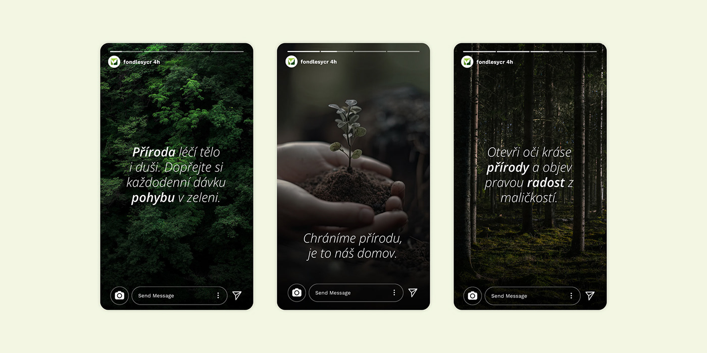
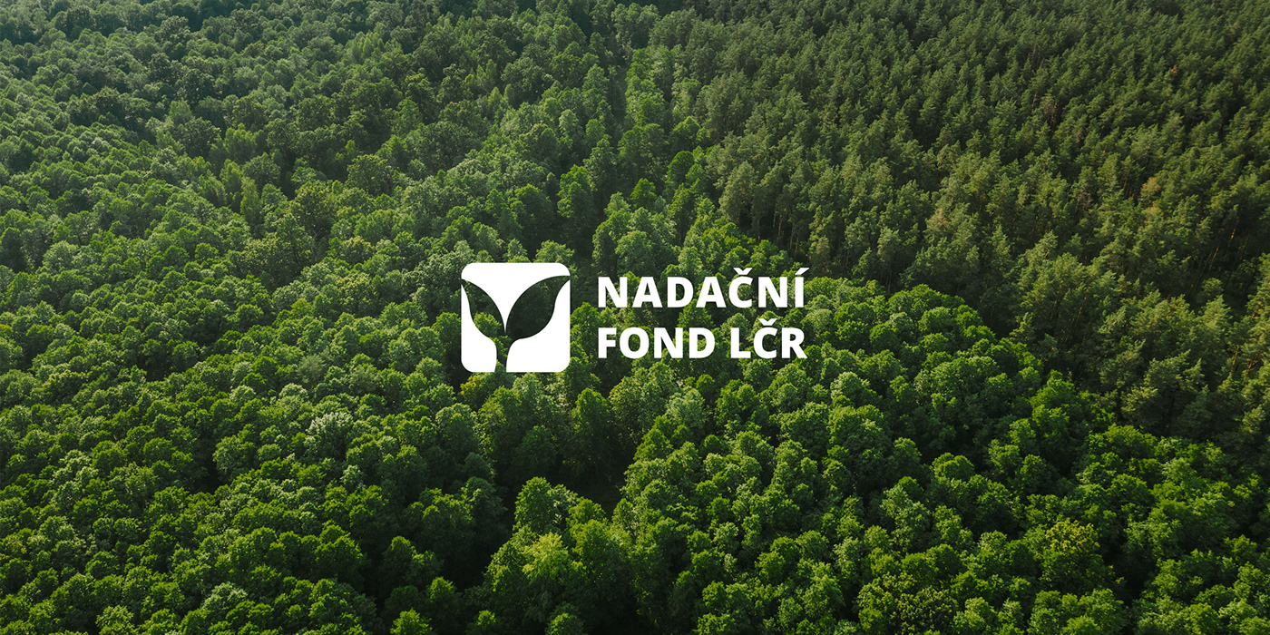
Part of the task was not only the creation of a logo and color scheme, but also the selection of appropriate typography and other graphic elements that would clearly identify the foundation and underline its mission. This graphic design was intended to be usable across multiple platforms and media, from websites and social media to printed materials and promotional items.
Another important part of the task was the creation of various advertising items and printed materials. These materials were not only intended to support the foundation's mission and goals, but also carried a common idea and helped spread awareness of the foundation among the public. The overall goal of this task was to create a comprehensive and attractive image of the foundation that would support its success and public involvement in its activities at a time when we are dealing with difficult situations of modern times.
-
[CS-CZ]
Úkol
Zadáním bylo vytvořit vizuální identitu pro nově vznikající nadaci, která by efektivně reprezentovala její aktivity a současně přilákala pozornost svým moderním stylem. Cílem bylo vytvořit nejen vizuální styl, ale celkový význam, který by reflektoval moderní přístup a inovace v oblasti ochrany přírody.
Součástí úkolu bylo nejen vytvoření loga a barevného schématu, ale i výběr vhodné typografie a dalších grafických prvků, které by jednoznačně identifikovaly nadaci a podtrhly její poslání. Tento grafický design měl být použitelný na různých platformách a médiích, od webových stránek a sociálních sítí po tištěné materiály a reklamní předměty.
Další důležitou součástí úkolu bylo vytvoření různých reklamních předmětů a tiskovin. Tyto materiály měly nejen podporovat poslání a cíle nadace, ale také nesly společnou myšlenku a pomáhaly šířit povědomí o nadaci mezi veřejností. Celkovým cílem tohoto úkolu bylo vytvořit komplexní a atraktivní obraz nadace, který by podpořil její úspěch a zapojení veřejnosti do jejích aktivit v době, kdy řešíme obtížné situace moderní doby.


[EN-US]
Approach
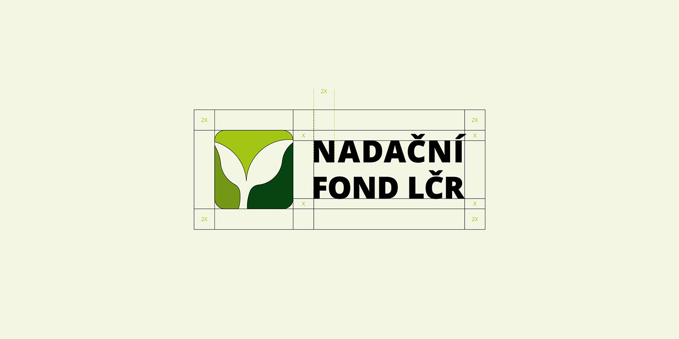
The golden ratio is a mathematical and artistic concept for graphic design. Its principle lies in the aesthetically pleasing ratio of the individual parts of the image. This ratio has been used in many fields of art and science for centuries, providing a harmonious and balanced sense of beauty and symmetry. In graphic design, this rule is useful for creating visually appealing elements.
The logo is a symbolic representation of a seedling embedded in a rounded square. Nature in the logo is also represented by its basic color, tuned to green. The structure is rendered using a minimalist style to achieve a "simple design".
Thanks to the use of basic colors, the uniqueness of the logo and the connection with the natural touch are significantly strengthened. We created the logo using the golden ratio to achieve maximum accuracy and adhere to the rules we believe a logo should meet.
-
[CS-CZ]
Přístup
Zlatý řez je matematický a umělecký koncept pro grafický design. Jeho princip spočívá v esteticky příjemném poměru jednotlivých částí obrazu. Tento poměr se používá v mnoha oblastech umění a vědy již staletí a poskytuje harmonický a vyvážený pocit krásy a symetrie. V grafickém designu je toto pravidlo užitečné pro tvorbu vizuálně přitažlivých prvků.
Logo je symbolickým ztvárněním sazeničky, vsazené do zaobleného čtverce. Přírodu v logu také reprezentuje jeho základní barevnost, laděná do zelené. Struktura je ztvárněna použitím minimalistického stylu k dosažení „simple designu“.
Zásluhou použití základních barev je významně posílena jedinečnost loga a spojení s přírodním nádechem. Logo jsme vytvářeli s použitím zlatého řezu, aby byla dosažena maximální přesnost a dodržena pravidla, která by podle nás logo mělo splňovat.